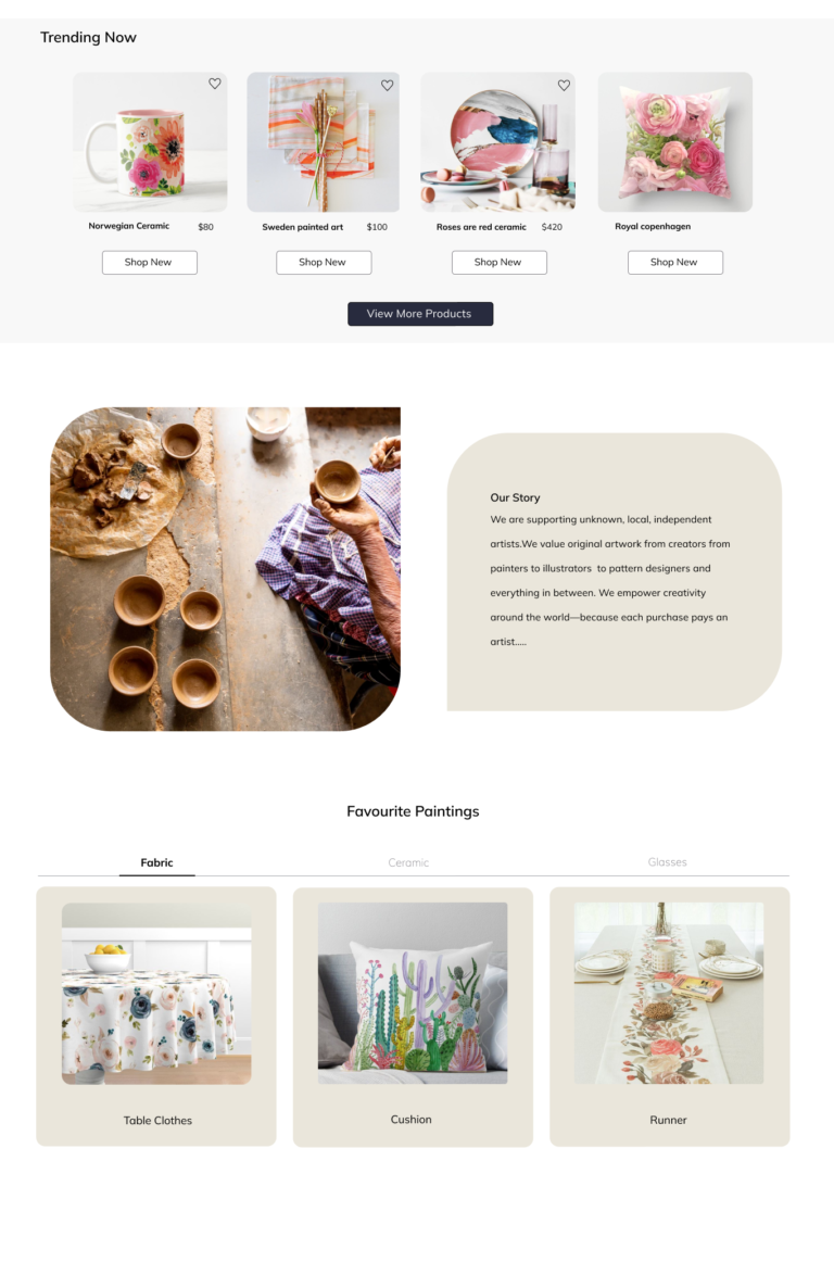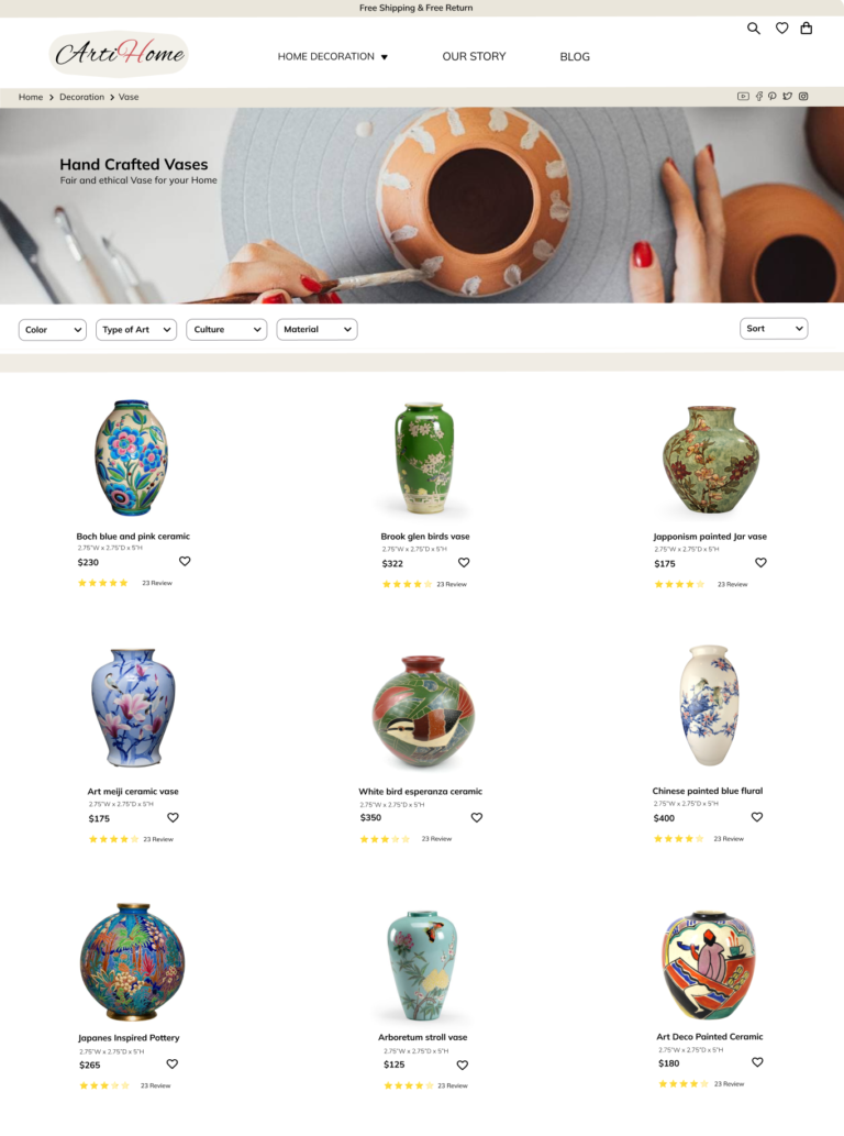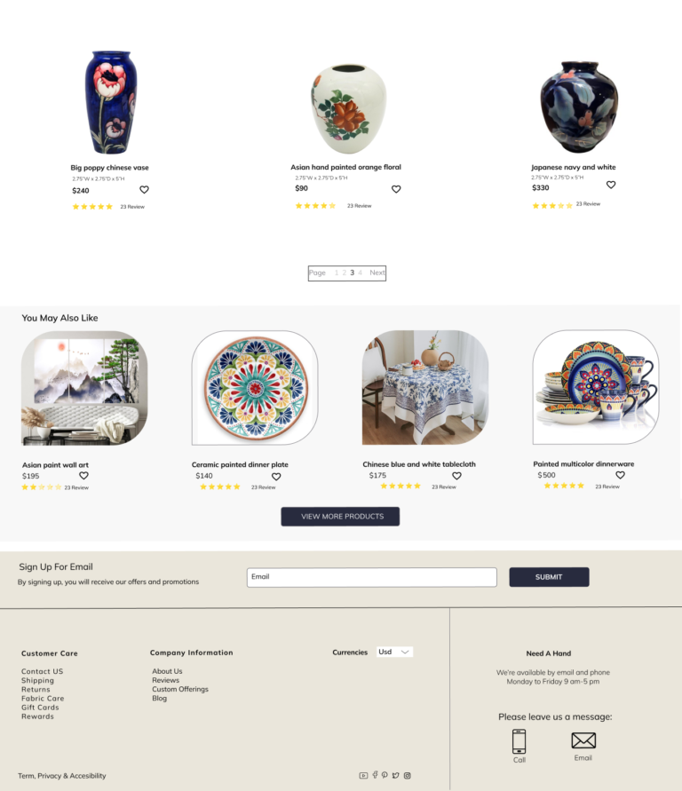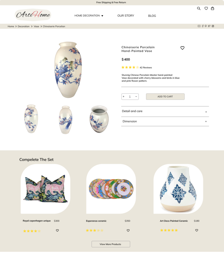
This is a project that I conducted with Arti Home, an online handmade home decoration website. Arti Home support local artists by buying from small businesses and selling it direct to art lovers. It allows users to:
- Browse all kinds of art and have a seamless purchasing experience.
- Browse and filter their art section based on their preference.
- Be educated with basic information about art.
project where l
assumed the UX
UI designer role.
Ideation
High Fi Wireframes
Wireframes
High Fi prototype
user testing
How might we attract buying customers by educating them about a different type of handmade art and making an efficient and error-free experience for them?
User Pain Point
- Lack of a diverse selection of arts.
- Lack of specific filter that helps users narrow down their options.
- Lack of information about types of art while customer shopping.
Arti Home website allows users to
- Shop a piece of art by learning a little about it.
- Including numerous images of the art that allows user to closely examine the quality of the art.
- Implementing filters that enable the user to refine searches easily.
RESEARCH
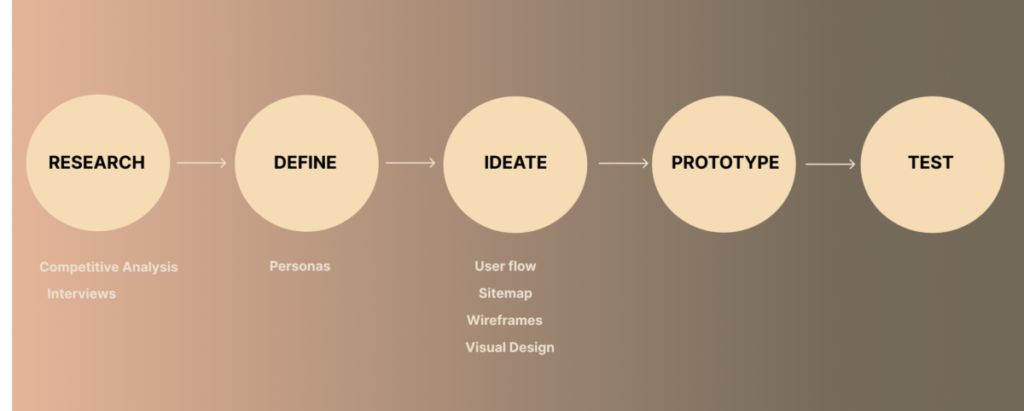
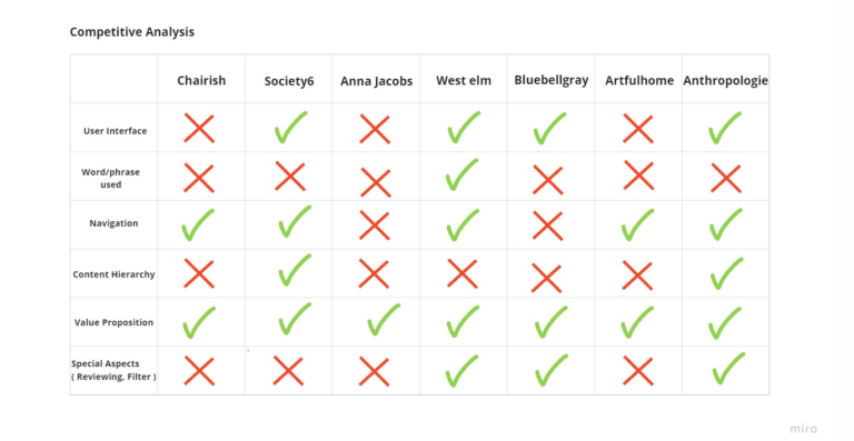
Starting off, we asked our selves a few initial questions: Who is our primary user? How are we different from other competitors? Why would someone want to use our website? How large of a scope do we want this project to be?
In order to construct a concise and solid foundation for Arti Home, we had to venture out and see what the prominent art websites were already offering and which user's goals were not being reached. We evaluated several features deemed vital from user surveys and identified which ones we could capitalize on to have a leg up over other websites.
DEFINE
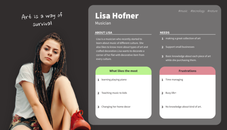
Using factors from the user, and market research, we created a main user persona.
IDEATE
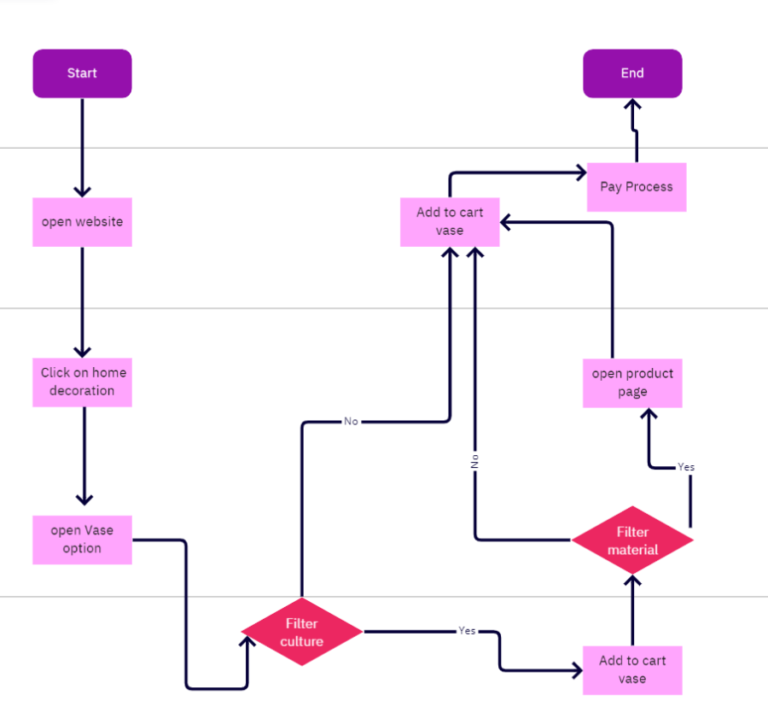
We constructed a user flow of what a basic start to finish journey looks like while purchasing an item. This helps us in understanding ways users can interact with the product, as well as allowing us to see navigation through user goals.
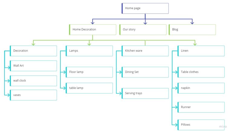
We have 3 categories with 4 subcategories and we wanted to clarify whether fewer categories would make sense to the majority of users or not. In this stage, we chose card sorting. All the results were analyzed to get the final structure for Arti Home.
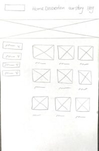
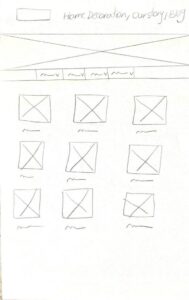
Before moving on to high-fidelity wireframes, we wanted to get a feel for what the core of the website would look like. We had so many challenges in design but one of the most important ones was designing filters. Our goal was that when users open filters, they see all filters on their screen without scrolling, after going through iterations of filter design we found a perfect way to solve this problem.
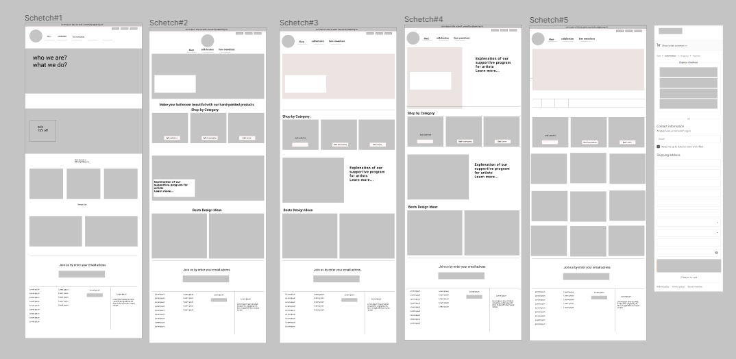
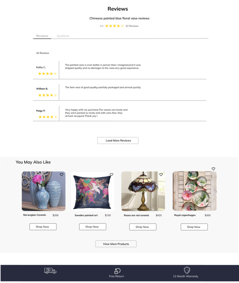
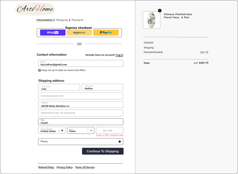
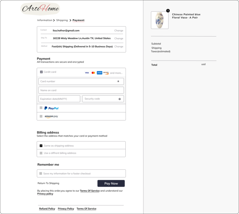
With my sketches by my side, I began to develop several mid-fidelity wireframes on Figma. These wireframes included the Homepage, Category Page, Product Details Page, and Checkout Pages.
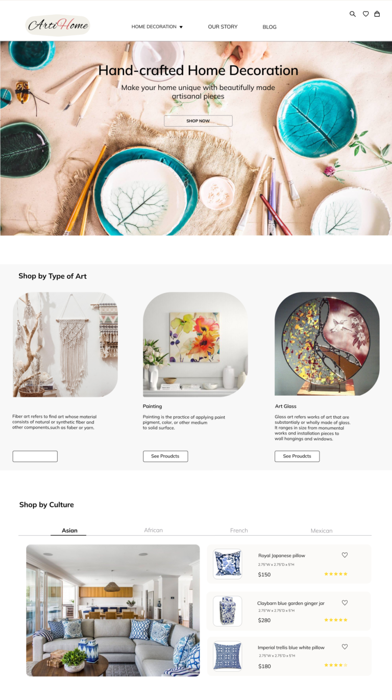
This design was inspired by nature and incorporates some of its elements because we believe art is derived from nature.

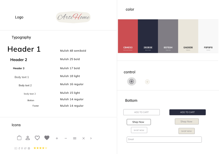
With the inspiration that we were able to get from the mood board, we then went on to create a logo that is simple as well. Afterward, we developed a UI Kit that aligned with the aesthetics and brand identity that we were aiming for.
PROTOTYPE
We built the prototype in Figma, making adjustments via feedback from team and preliminary user testing.
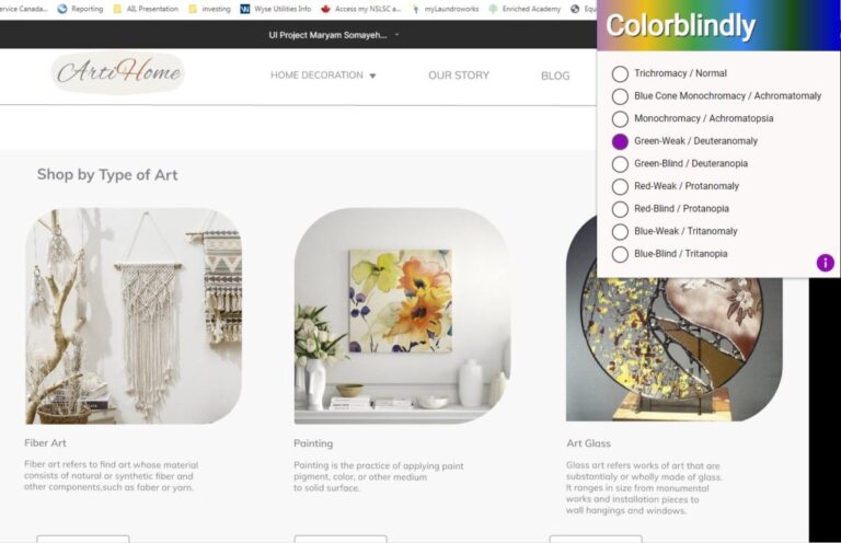
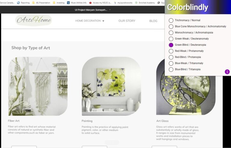
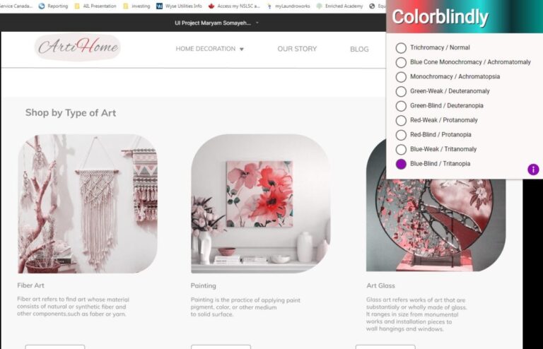
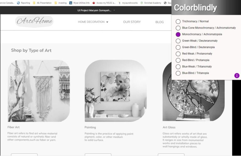
We tested our website through color blindness to fulfill larger target audience needs.
TEST
In order to test the Arti Home website, we conduct a usability test to know how a user can across the website? and which features can improve? and how we can scale up our website?
As we observed the user navigate through the website, we noticed the user was able to successfully Browse art categories, Select the product, learn about it, Add it to the cart and check out.
