SPROUTS

It is a project that we redesign with Sprouts based in Phoenix, Ariz. Sprouts is a supermarket website where users can order groceries online. It allows users to filter their category based on their needs. It also has many recipes for the most current diets.


My Role This was a group project and I have conducted interviews, paper and digital wireframing, low and high-fidelity prototyping, conducting usability studies, accounting for accessibility, iterating on designs and responsive design.
Tools Figma, Adobe XD, Maze
Duration 4 weeks
PROBLEM

How might we create a website that helps users with efficient systems for browsing through products? How we can make the store finder process easy for users?

Users pain point:

  • Not clear navigation
  • Doesn't show store by users location
  • Doesn't categorize by user's need
  • Online shopping websites don’t provide an engaging browsing experience 
 
GOALS

Design a Sprouts grocery website to be user friendly by

  • Changing the layout of the land page
  • Providing clear navigation
  • Offering a friendly location funder
  • Categorized very clear and based on users' need
Design Process

RESEARCH

RESEARCH  →  DEFINE  →  IDEATE  →  PROTOTYPE  →  TEST

HEURISTIC EVALUATION

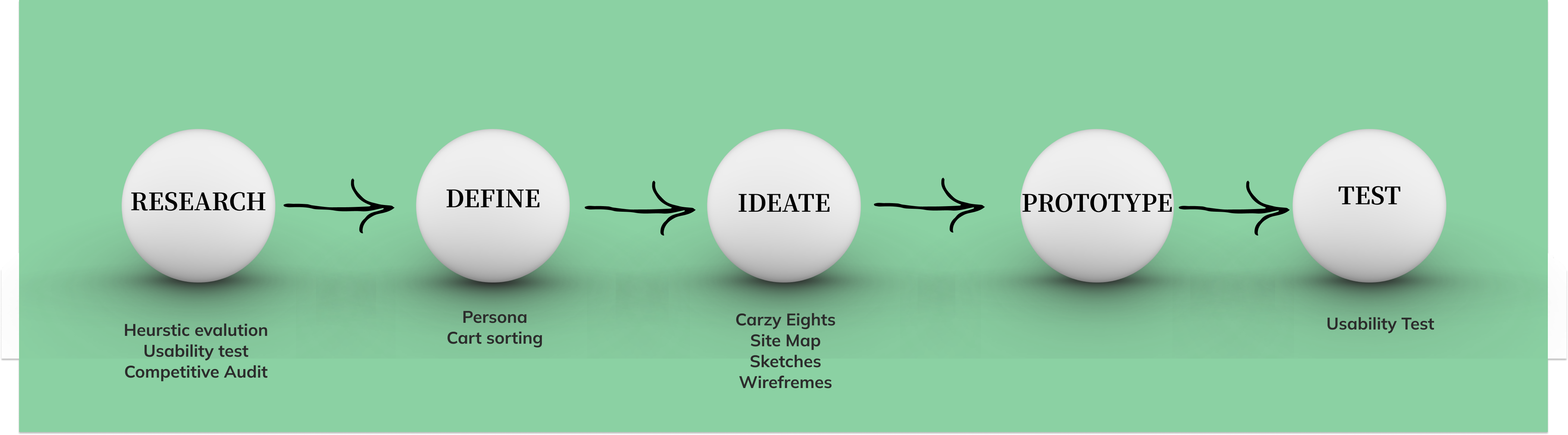
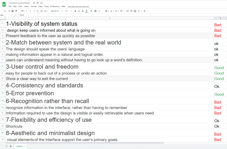
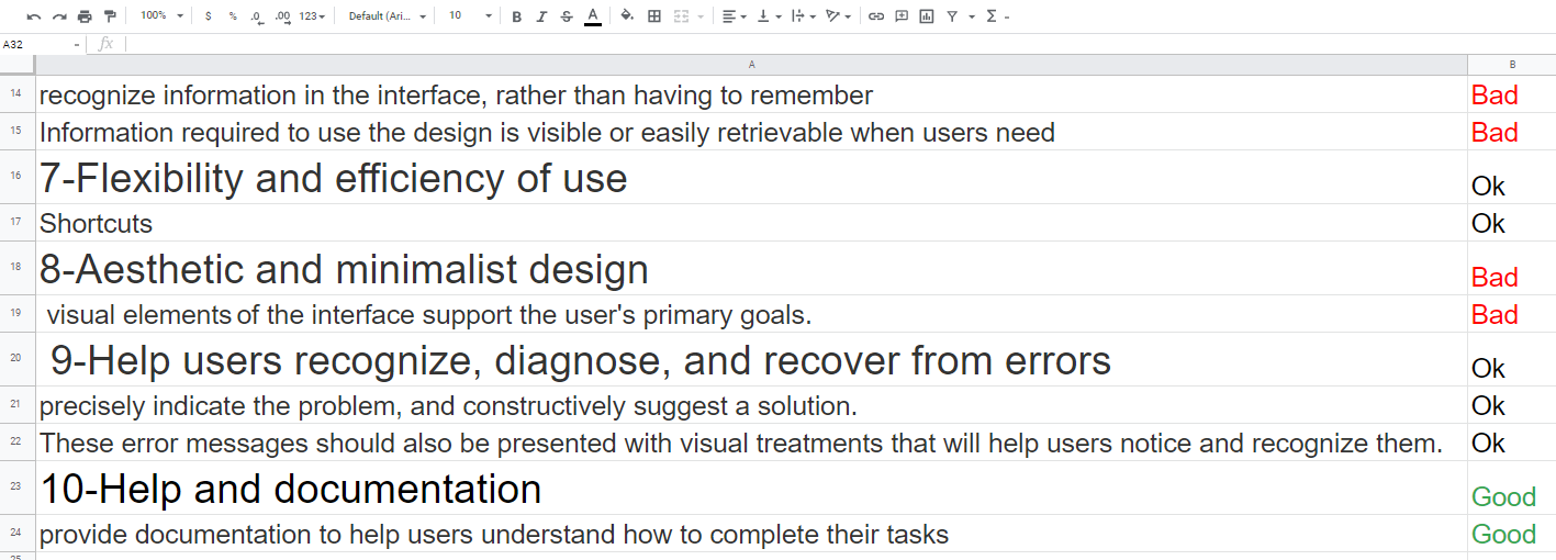
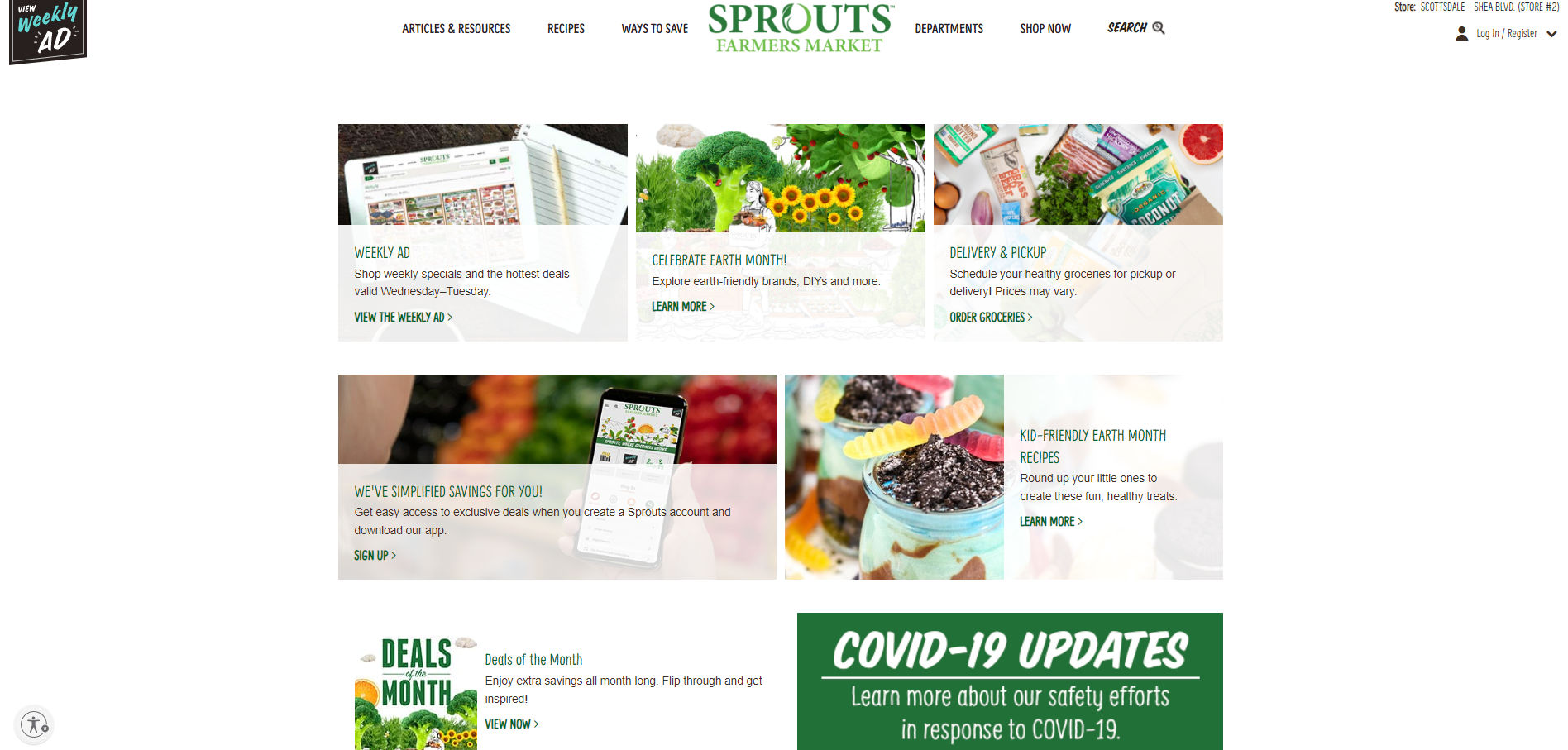
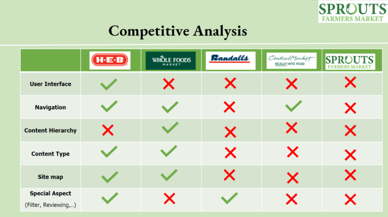
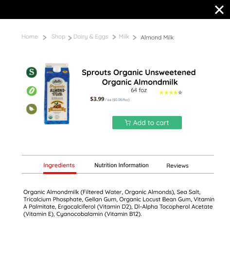
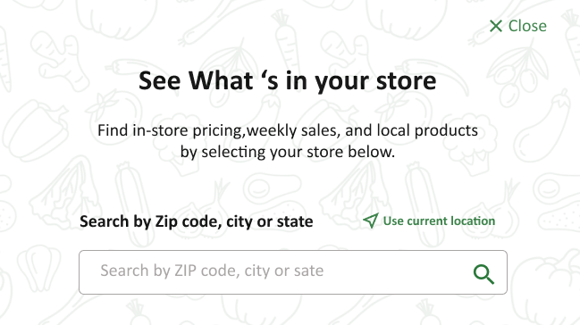
To start, we wanted to understand, from our perspective, the issues that might occur when users use the site. To do this, we did a heuristic analysis. We made a google sheet and rate the important items as good, ok, and bad. The 'bad' part was our main focus.  


Heuristic evaluation
USABILITY TEST

At first, we tried to answer this question: what led us to conduct this usability test? Next, we clarify what we'd like the outcomes of the research to be. After that, we determined our study participants based on the right matrices. We conducted 3 usability tests to further verify and add to those concerns we had. From these tests, there were common trends in the concerns the users had when accessing the site:


”Where should I start shopping?”

“I didn’t realize this is a supermarket  website”

“I select all that I want but when I want to pay, ask me to chose my location than it takes my in the new page that I should start all over again”

This is the home page which doesn't have any hero image, this led the users to be confused on where to start on the site
COMPETITIVE ANALYSIS

For getting a better idea from our competitor we conduct competitor analysis and find out the strength and weaknesses of our competitor. It helped us to find our situation in the market.


DEFINE

RESEARCH  →  DEFINE  →  IDEATE  →  PROTOTYPE  →  TEST

PERSONA

We used the research we've conducted so far and start personifying the users we've designed for.


CARD SORTING

Our information architect is informed by many sources, like user research and competitive analysis, knowing our users, their goals, and their behavior. All this knowledge helped us to create an effective IA.


IDEATION

RESEARCH  →  DEFINE  →  IDEATE  →  PROTOTYPE  →  TEST

CRAZY EIGHTS

In this stage, we decided to use the crazy eight methods. The goal was to explore lots of ideas at lightning speed which forces us to think creatively without limit. We knew no idea is too outrageous during a brainstorming.


SITE MAP

Based on collected information on cart sorting we map an outline to see which area of our website requires more elaborate connectivity to help the user reach the necessary pages.


SKETCHES

We came up with 5 home page ideas and we identify which feature we like the most. We added stars next to the part of different wireframes that were our favorite. After that, we combined them into one new wireframe.


DIGITAL WIREFRAMES

Moving from paper to digital wireframes made it easy to understand how the redesign could help address user pain points and improve the user experience. We used Adobe XD to challenge ourselves with the new tool. A key part of our strategy was visual element placement on all pages and the right place button.  


PROTOTYPE

RESEARCH  →  DEFINE  →  IDEATE  →  PROTOTYPE  →  TEST

HAIGH - FIDELITY PROTOTYPE

We used Figma in this stage because when we tested our pages in Adobe Xd we realized users can feel like real websites so we discuss to switch on Figma. We put after and before pages to show the improvement of the website. 


Landing page
Product pop up
Location reminder

TEST

RESEARCH  →  DEFINE  →  IDEATE  →  PROTOTYPE  →  TEST

USABILITY TEST

When the wireframes were ready, we conducted a series of usability tests. The most
important parts I wanted to validate were how easy it is for users to find a product because that was one of the important parts of this project. We did the tests remotely using Figma. The biggest surprise was the friendly location reminder part which makes it so much easy for users. Here are some of our changes.


WHAT DID I LEARN?

I learned that even a small design change can have a huge impact on the user experience. The most important takeaway for me is to always focus on the real needs of the user when coming up with design ideas and solutions.