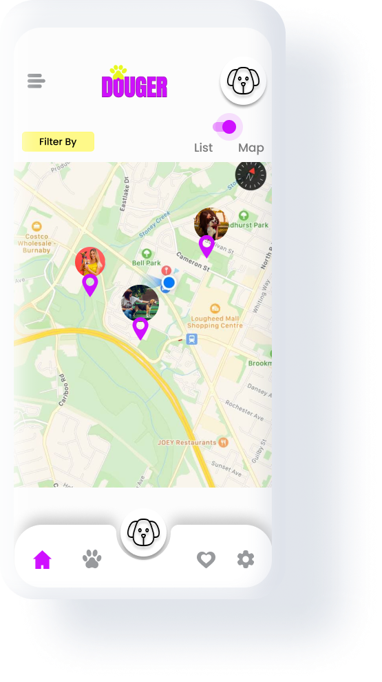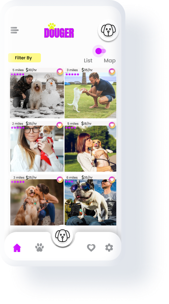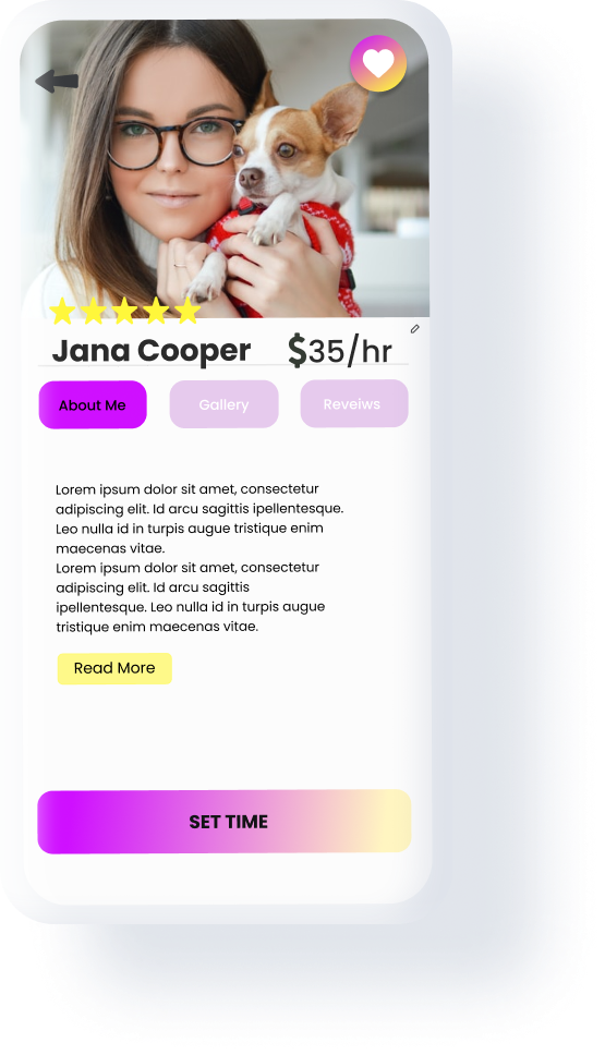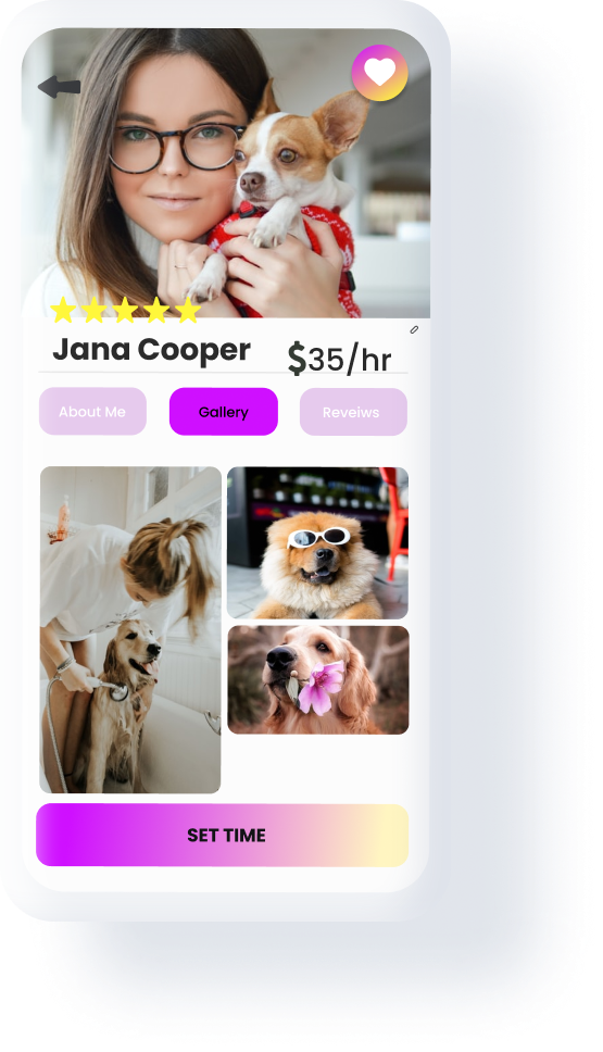
Douger is a dog walker app for dog owners who are looking for a fast and quick way to find professional dog walkers. With Douger, dog owners can track their dogs while they are out with their walkers.
interviews
wireframing
prototyping
test
iteration and
design
Marvel
Ideation
High Fi Wireframes
Wireframes
High Fi prototype
user testing
Dogs are like family to us we want to make sure they are safe. How we might help dog parents to have peace of mind about their dogs when they are out with their dog walker? How can we help dog parents to find a dog walker on short notice?
User pain point
- Dog owners don't know where their dogs are when they are out.
- Booking dog walkers online is a long process.
- Booking dog walker platforms are not equipped with assistive technologies.
With Douger app
- Dog owners can select nearby dog walkers that are available immediately.
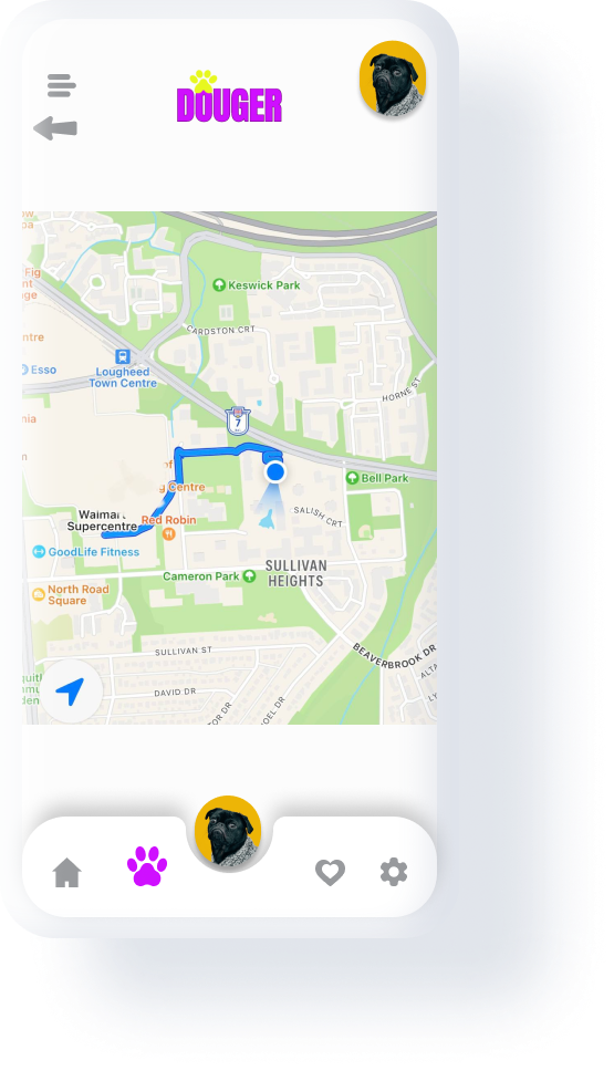
- Dog owners can track their dog on a map when they are out with the dog walker.
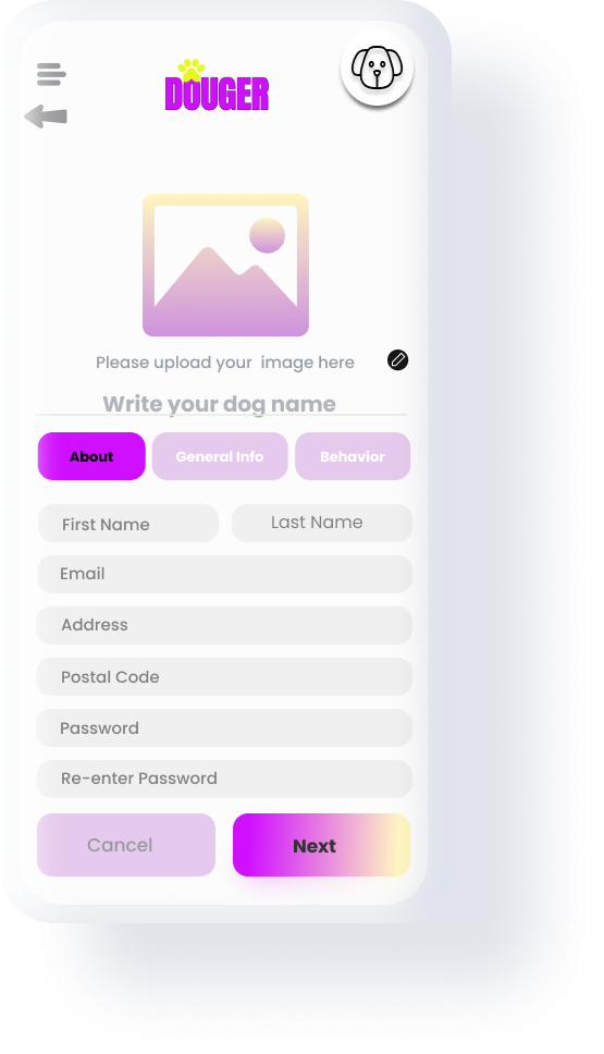
- Dog owners can have an account for easy accessibility.

RESEARCH
l began the process with research goals to: identify and analyze Douger's competitors in order to gain a better understanding of the dog walkers app industry, and uncover gaps among the existing apps. l also wanted to discover what percentage of people use dog walker apps, and lastly, to learn who my users are? are they young and busy or old and retired? Afterward, I conducted a competitive analysis of iOS apps and websites that shared similar target audiences and provided similar services as Douger. I checked App Store reviews to gauge the strengths and weaknesses of each competitor and read customer reviews of the competition. I then downloaded all competitor apps on my phone and rate them based on first impression, interaction, visual design, and content on my google sheet.
To better understand the pain points and goals of those who use dogwalker apps and to answer other parts of my research questions that the secondary research was unable to answer, l made a survey and sent it to all dog owners which l found on Instagram by using #doglover #dogparent #ilovemydog #dogisafamily and also on dog owners Facebook groups. l also interviewed 22 people.
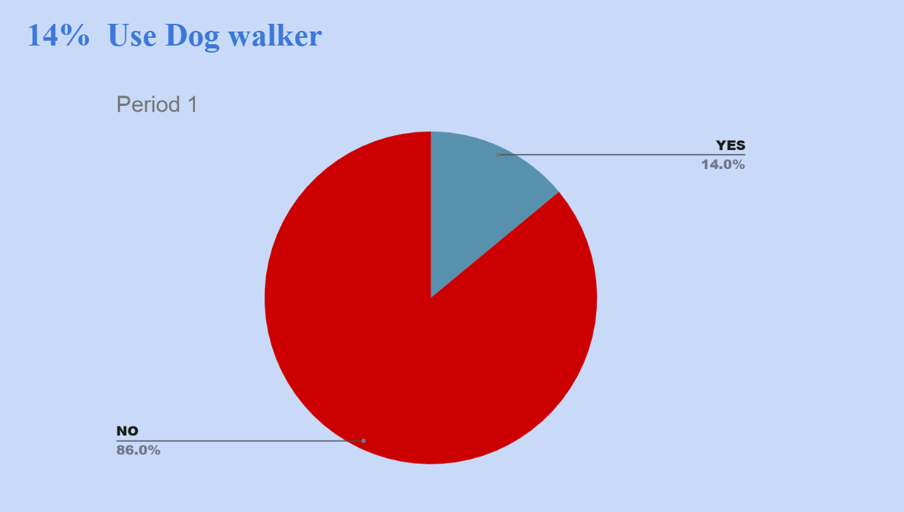
- 86% of people don't use the dog walker apps
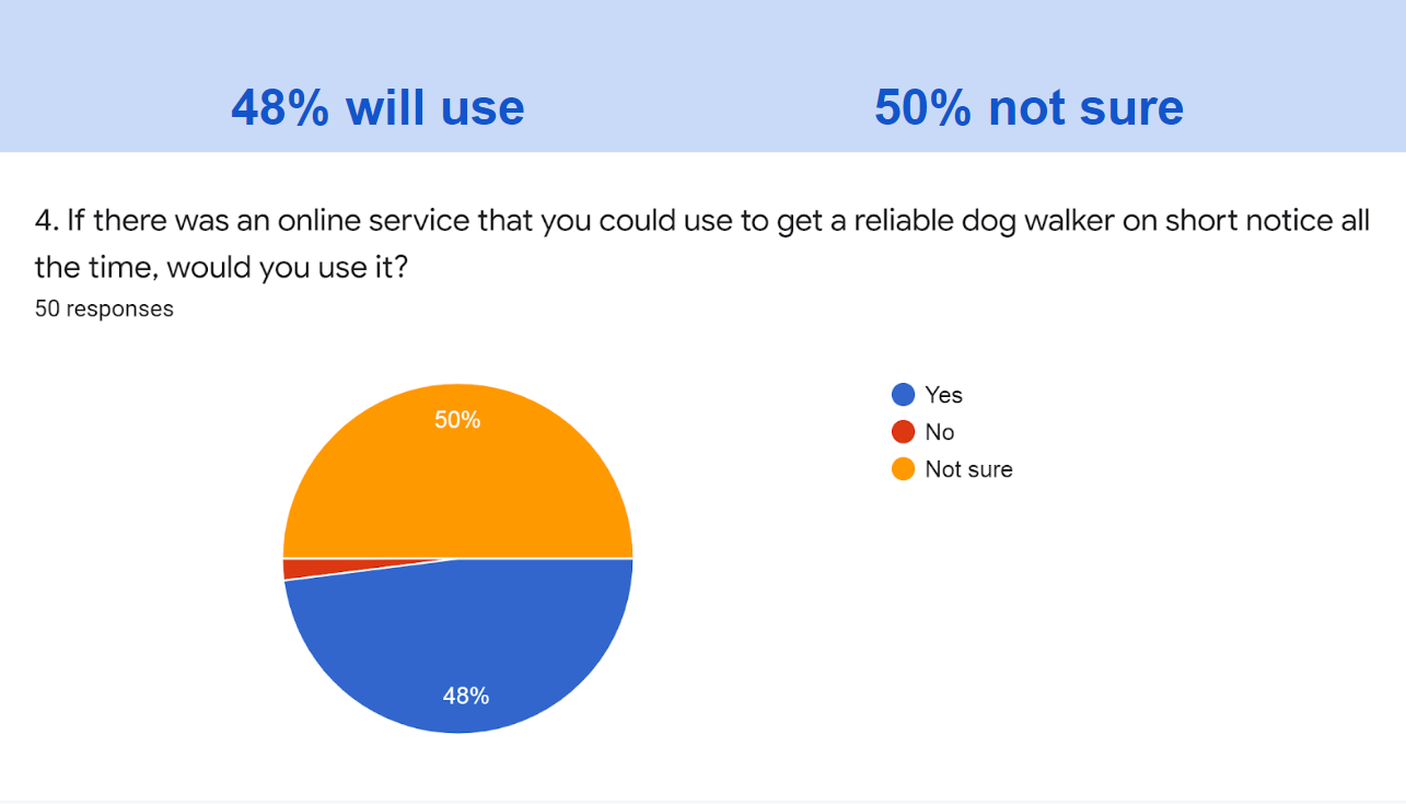
- 48% of people would use dog walker apps if they find a reliable dog walker apps
- 60% of our users are busy yang people
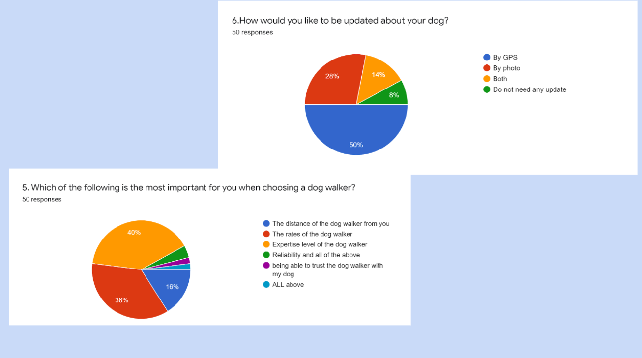
- 50% of users want to get an update from their dog through GPS
- Rate and experience are very important for dog walkers
DEFINE
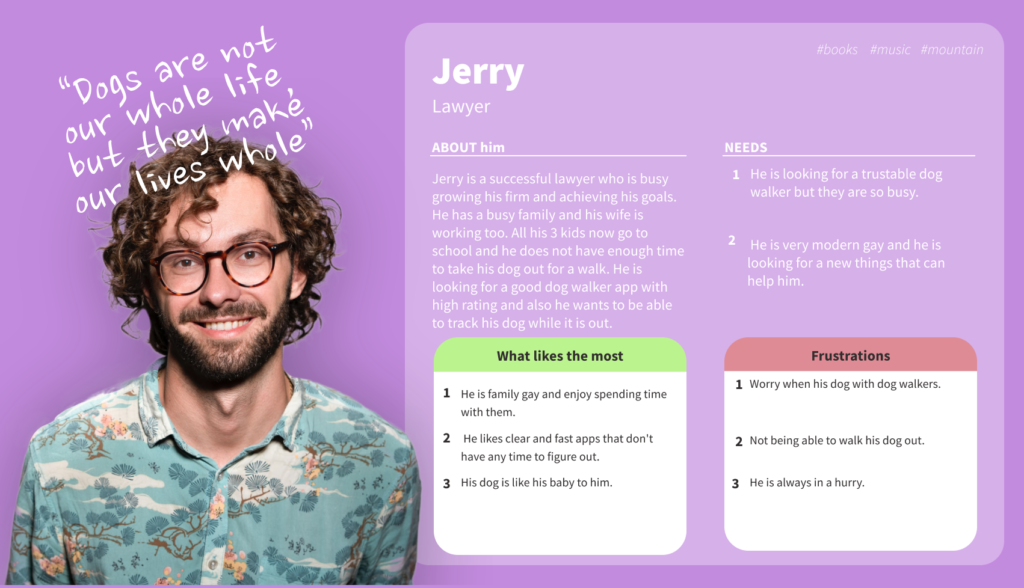
According to the research analysis and synthesis, I tried to find a common theme in our data and grouped users who personify those themes. So, I created personas.
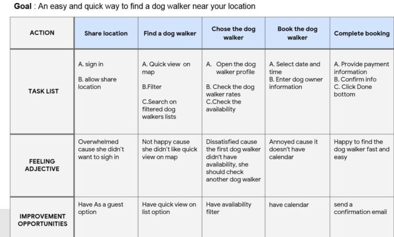
I created User Journeys for each User Persona to better understand the steps they go through when interacting with the product. The journey starts with opening the app and looking for a dog walker and ends with booking a dog walker.
IDEATE
I developed an app map to solidify the organization of screens within the app.
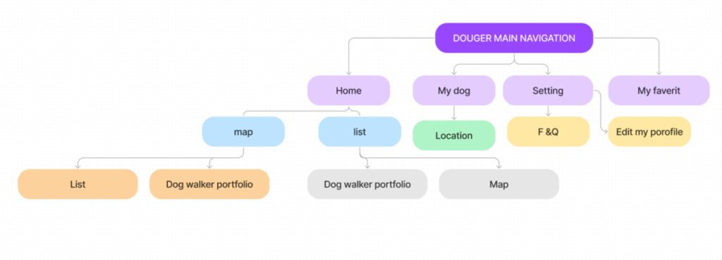
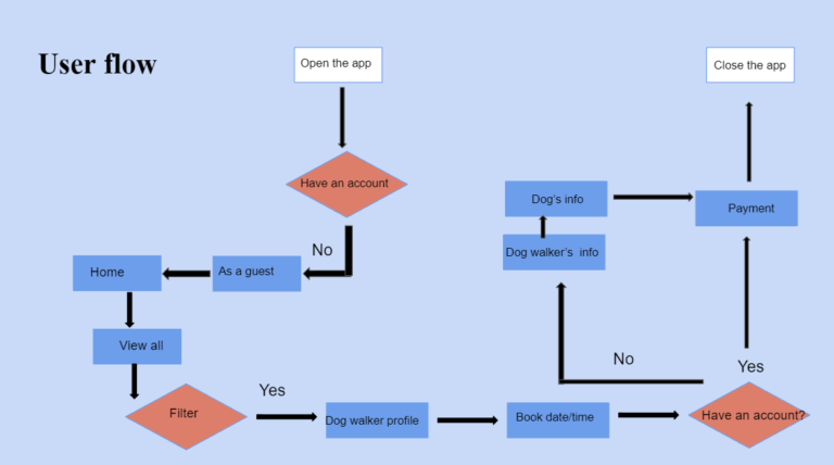
Using the research findings, sitemap, and developed persona, I was then able to chart a user flow. The flow below shows several main paths for a use:
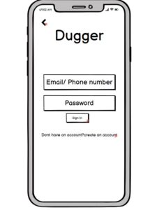
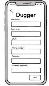
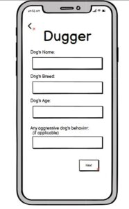
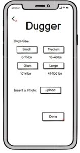
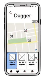
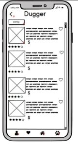
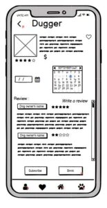
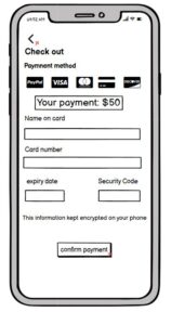
We started to make low fi-wireframes in Marvel. This enabled us to visualize the early designs more concretely, see how the interactions flowed, and to be able to have users test it out. After receiving feedback and implementing some changes to the wireframes, we moved on to the visual design phase.
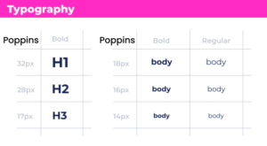
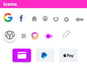
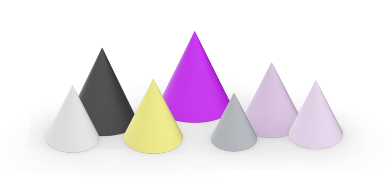
A design system is a collection of frequently used elements (buttons, input fields, colors, typography, etc.). I always start building the system after a couple of screens are ready from the visual design. Design systems are a huge time saver, both on the design and the development side of things. Creating designs is much faster with a design system, and we can maintain consistency even if the application has hundreds or thousands of screens with ease. Design systems significantly reduce development time.
Keeping in mind that the app should be fun and energetic, I designed a clean and modern interface with subtle pops of color in the UI elements.
PROTOTYPE
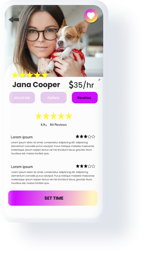
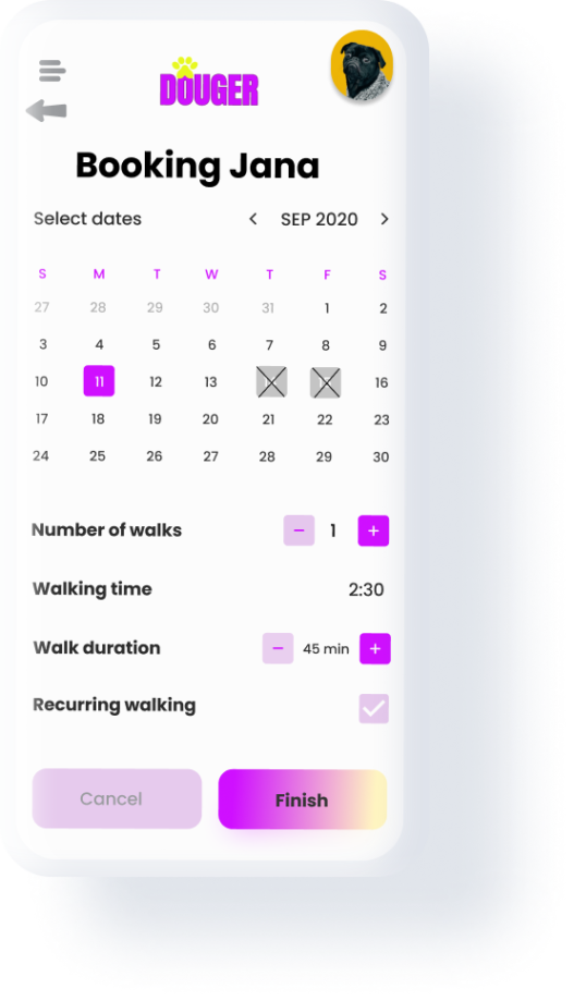
For the final visual designs, we used Figma. During this phase, we kept our user personas in mind, and created all the screens for the Douger app. The goal of the design was for users to find nearby dog walkers, book a dog walker, make an account, checkout and also met user needs for tracking dogs online while they are out.
This is how users can track their dog when they are out.
TEST
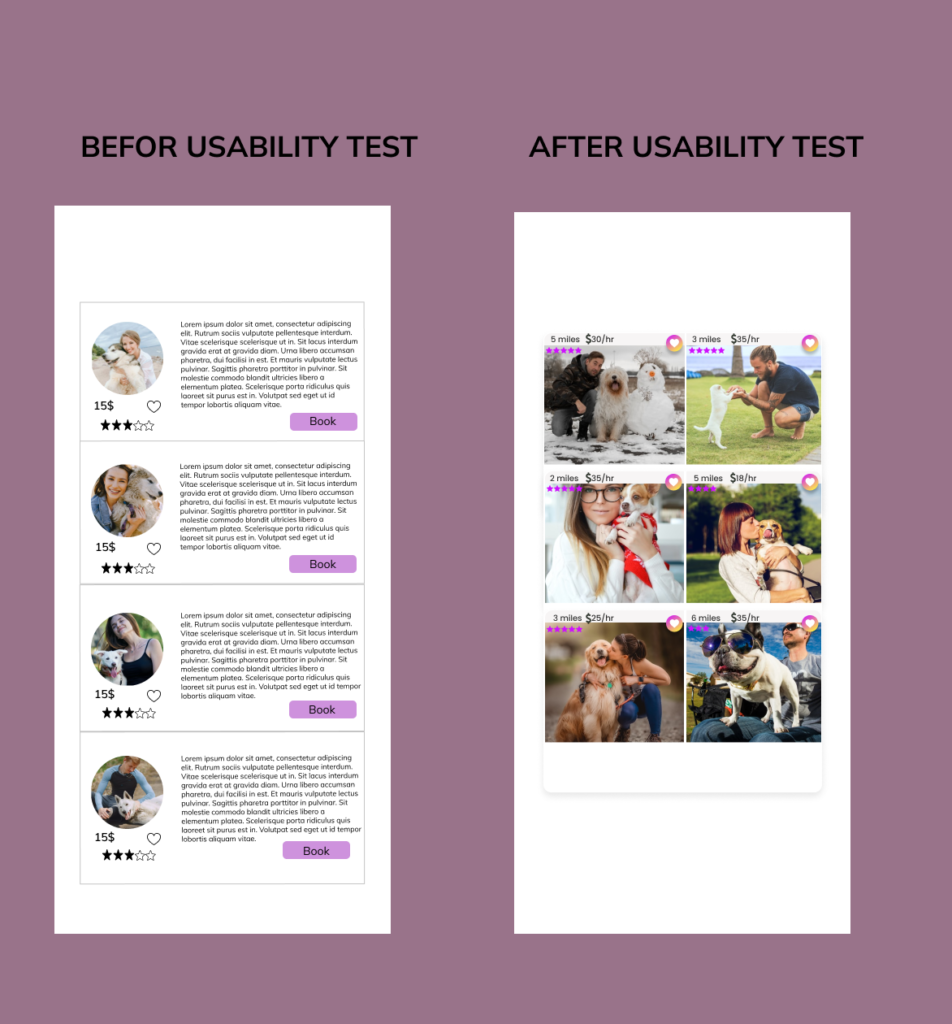
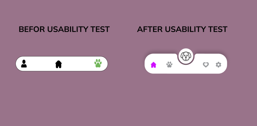
Usability tests are vital when building digital products. Participants are asked to perform a series of tasks during a test while observing them and making notes. The usability test's goal is to uncover flaws and things that are not straightforward in the designs. We can iterate the designs using the test findings and create a much better, smoother user experience. Some of our changes are below.
- Used icons to help make navigation easier
- Checked color before use to make sure it is good for better accessibility
- Used sans serif typography to make reading easier
- Use sharp colors for highlighting the important things
While designing the Douger app, I learned that the first ideas for the app are only the beginning of the process. Usability studies and peer feedback influenced each iteration of the app’s designs.


