Consent Management
To gain a deeper understanding of the problem and the users, we conducted interviews, and a competitive analysis of similar systems. Since there was no existing consent management system at ISED, we started by researching the best practices in the industry and the needs of ISED's users. In addition, we interviewed several employees at ISED to get to know the department, its functions, and its users. These interviews helped us to understand the unique needs and challenges of ISED's users, and to design a consent management system and a dashboard that would meet those needs. From our research, we discovered that users were overwhelmed by the amount of information presented to them, and were struggling to find the information they needed to make decisions about access. We also found that users were frustrated by the time it took to complete the process. Armed with this knowledge, we were able to identify areas for improvement and design a new consent management system and a dashboard that would be efficient, user-friendly, and secure.
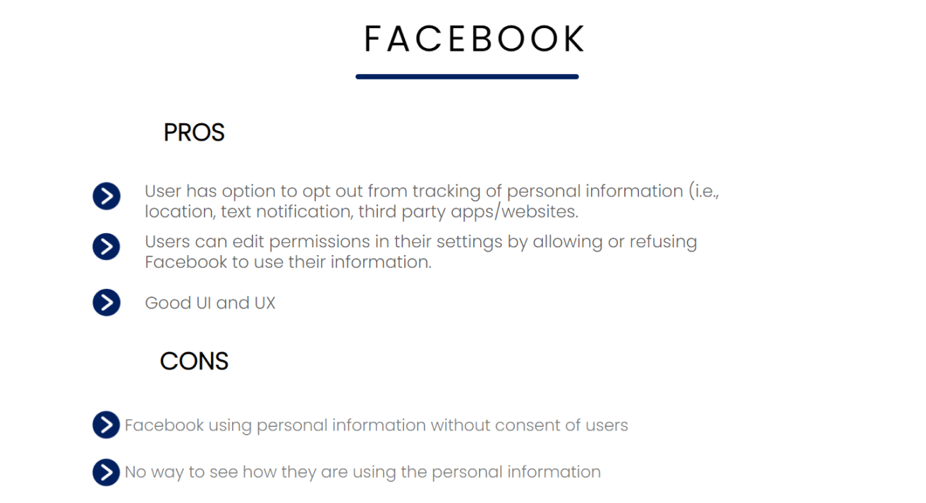
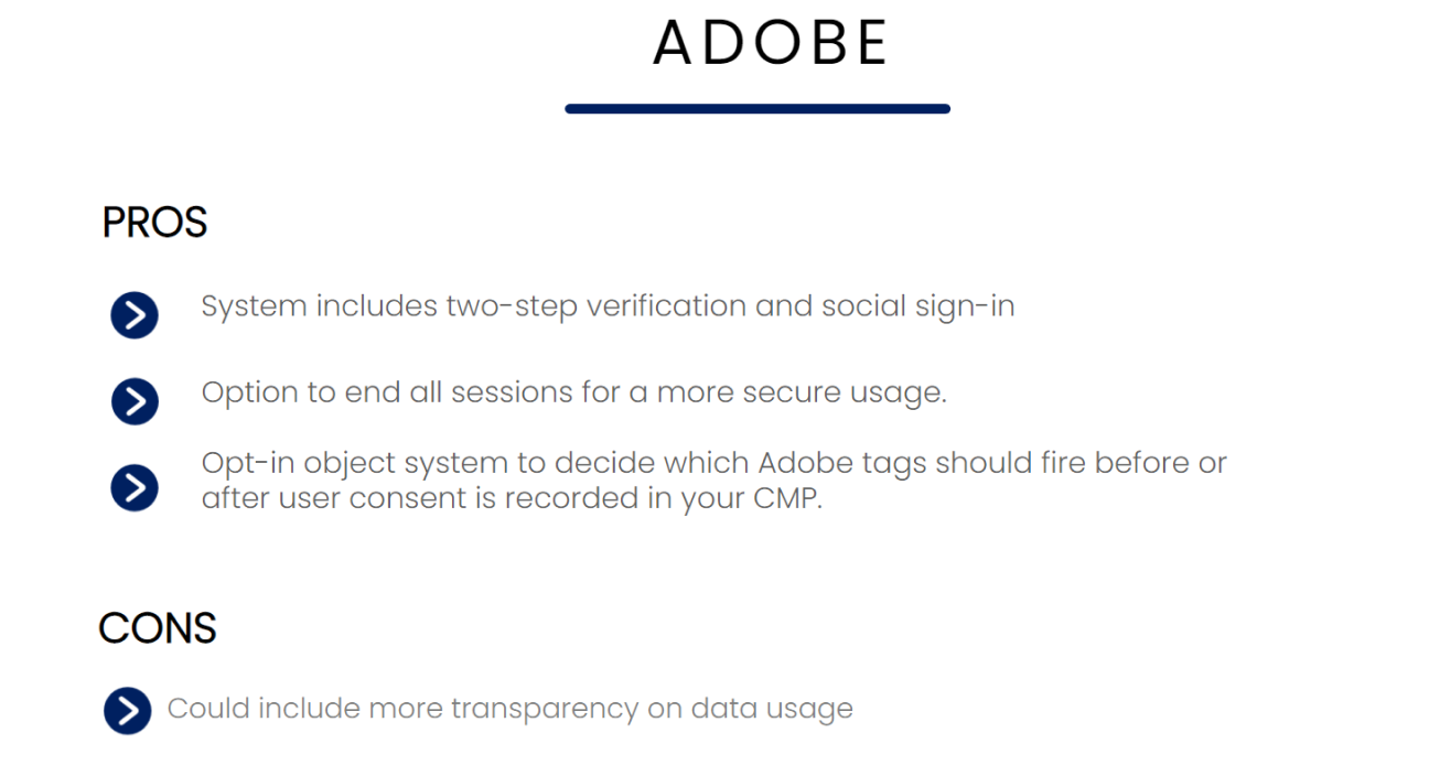
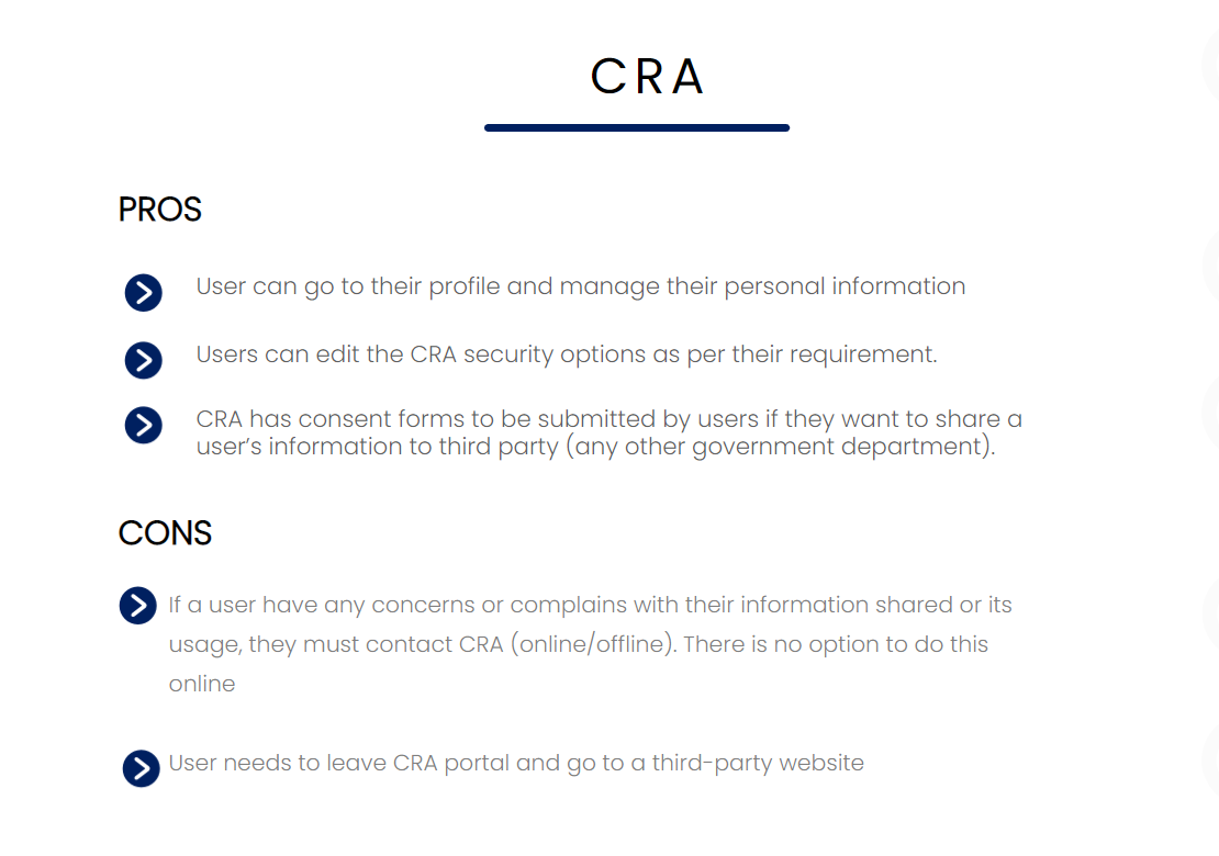
To gain a better understanding of the market and the competition, we conducted a competitive analysis of similar systems. We started by randomly selecting several websites that we believed had the capability of managing consent, such as Facebook, Adobe and Google. We analyzed their processes and procedures for managing consent, as well as their user interfaces and user experience. To evaluate these systems, we created a list of pros and cons for each one. This helped us to identify the best practices in the industry and to design a consent management system that would be both innovative and user-friendly. We also took into account the unique needs and challenges of ISED's users, and designed a consent management system and dashboard that would meet those needs.
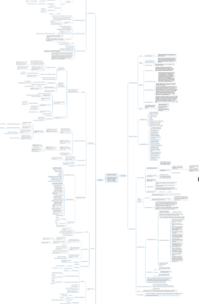
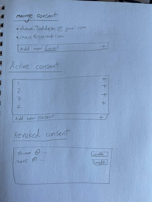
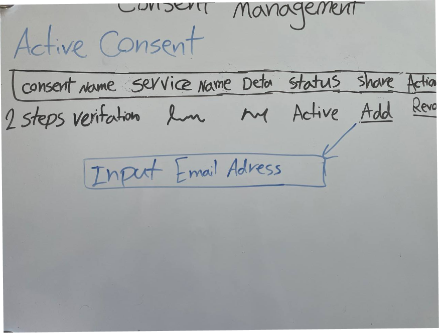
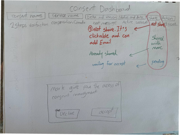
During the ideation process, I encouraged everyone on the team to share their ideas and ensured that all ideas were valued and considered. I used various brainstorming techniques, such as mind mapping and SCAMPER, to generate a wide range of ideas. I also used design sprints to rapidly prototype and test different concepts. My goal was to create an environment where everyone felt comfortable contributing and where all ideas were given equal consideration. This approach helped us to generate a diverse set of ideas and ultimately led to a more innovative and effective solution.
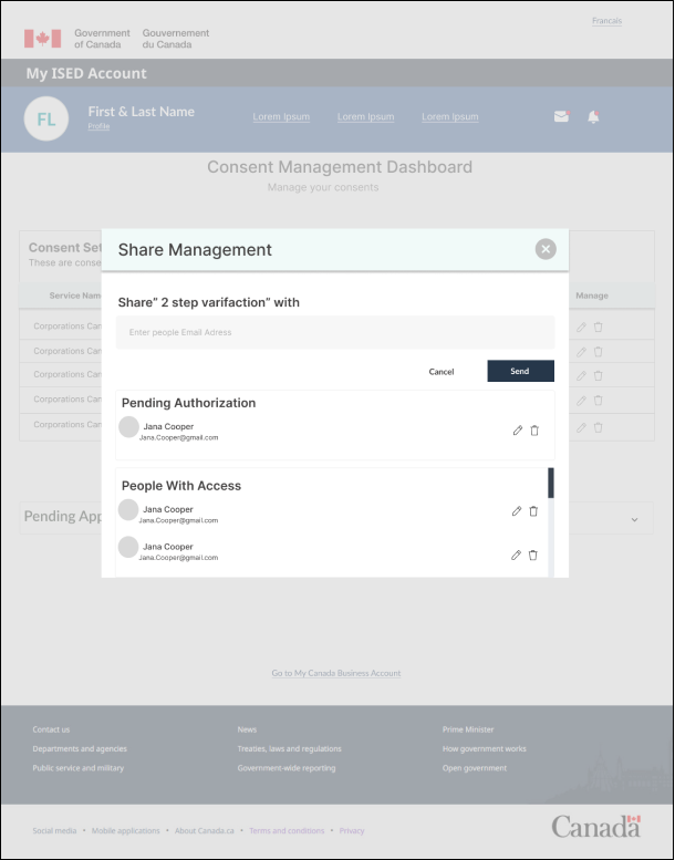
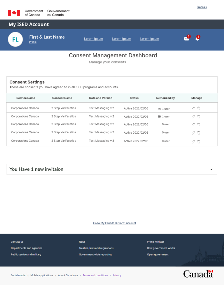
Using wireframes and mockups, we created a prototype of the new consent management system. We used these prototypes to test and refine our designs, incorporating feedback from users and stakeholders to make improvements. We iterated on the designs several times to ensure that we were creating the best possible experience for users.
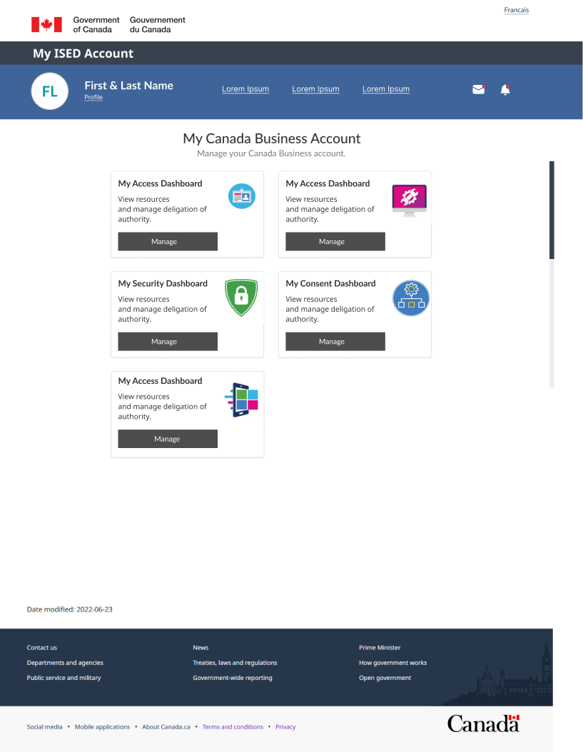
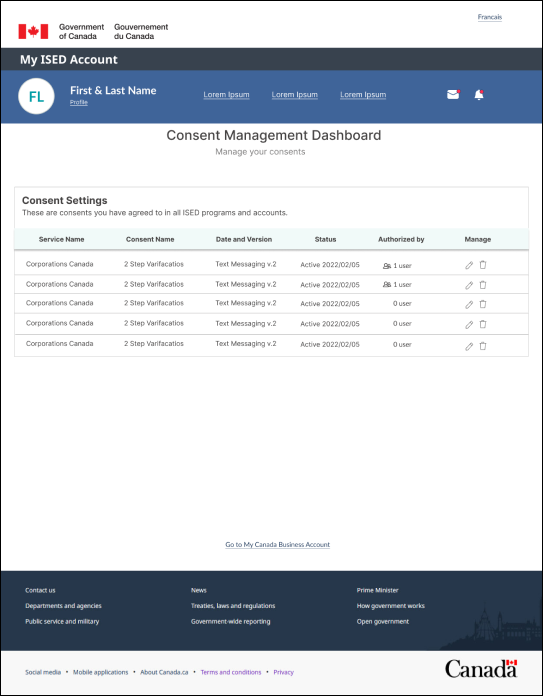
ISED dashboard
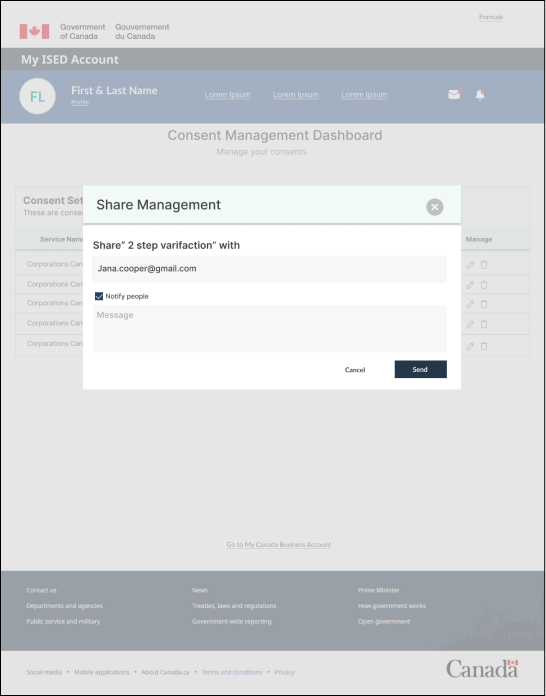
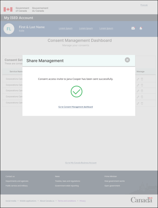
Sending consent authorization invitation
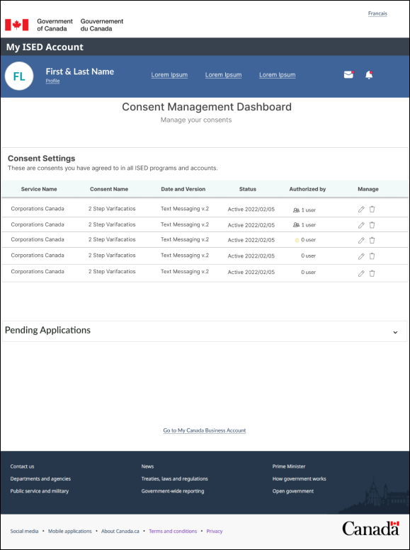
Pending consent authorization
Getting consent invitation
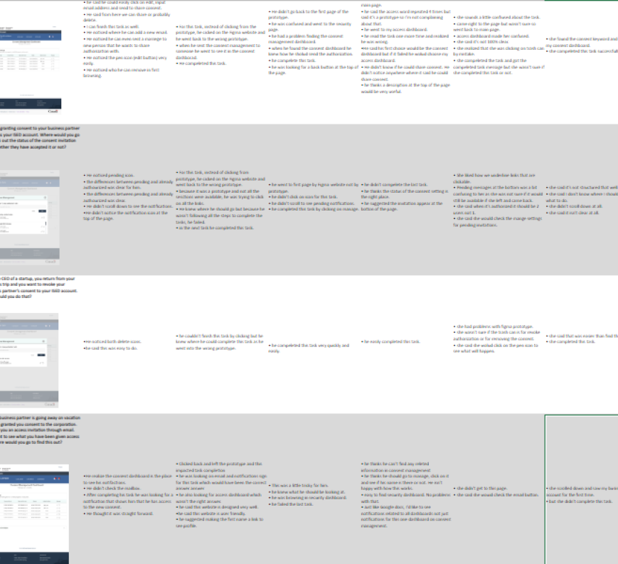
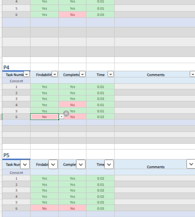
We conducted user testing on our prototype to get feedback on the design. We recruited a variety of users to test the system and provided them with scenarios to complete. To facilitate the testing process, we used the MYUI website, which allowed us to record the user's interactions with the system and collect feedback in real-time. We then analyzed the data and identified areas for improvement. We iterated on the design based on the feedback received and conducted additional rounds of testing to ensure that our changes were effective. All the data and feedback collected during the user testing process were documented and organized in an Excel file for easy reference.
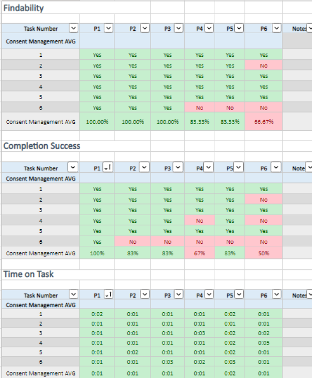
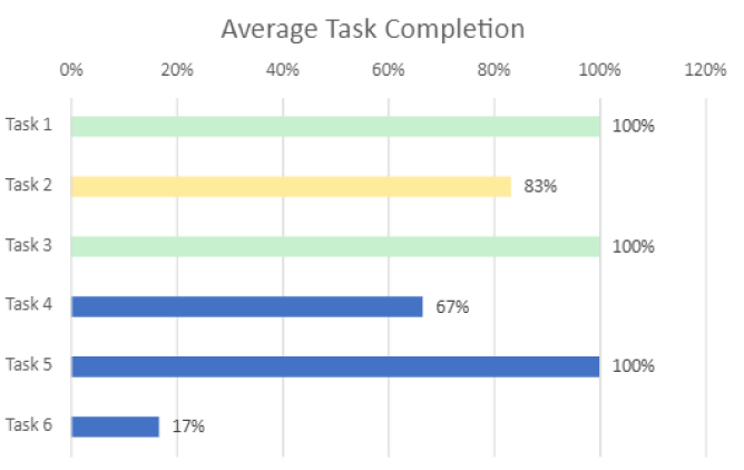
To analyze the user testing results, I first reviewed all user recordings and took detailed notes on their feedback, including how they felt, what they said, and any issues they encountered. I then measured the time it took each user to find the necessary information and complete the given task. Using this data, I calculated the average time it took for each task and identified any tasks that had significantly longer completion times than others. Next, I created a graph to visualize the data, which I presented to the client to demonstrate the usability issues in the current design. By providing a clear representation of the data, I helped the client understand the process and the areas that needed improvement. With this analysis, we were able to propose targeted solutions to address the specific usability issues and improve the overall user experience of the consent management system.
After conducting usability tests, we made several changes to the consent management system.
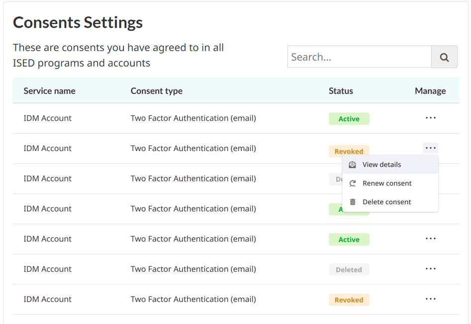
- Assign color codes to status for faster recognition by users
- Reduce column titles font size up to 22px and table content font size to 20px for improved readability
- Place actions in the kebab dropdown for a focused experience and easy access to all actions
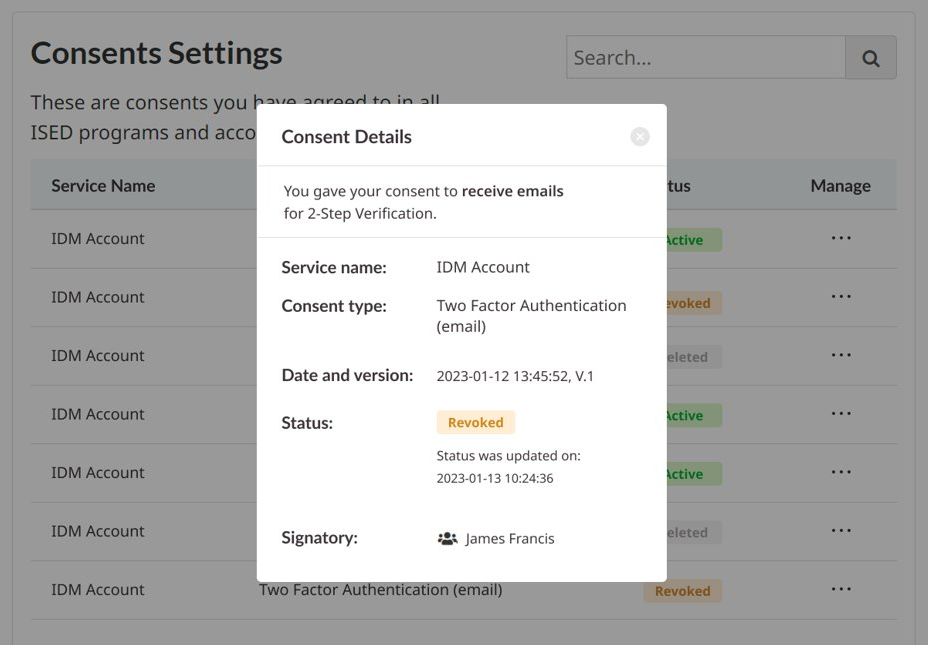
- Move additional information to "View details" to make the table mentally digestible
- The most important information that users need to see right away are Service name, Consent type, and Status
- Columns like Date and Version, Status update date, and Signatory are not necessary for users to see every time they open the table
- By having fewer columns in the table, there is more space for full text display without squeezing it into two lines
